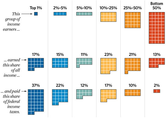
David French includes the above chart in his excellent post on America’s dependency problem. It illustrates the true breakdown of federal income taxes by income level more intuitively than anything I’ve seen in recent memory. Everyone should spread it on their social networks and save a copy to their computers, phones, iPods, Kindles, etc. to keep on hand for sharing with friends who don’t know the facts. Because apparently the RNC and the Romney Campaign – the guys with money and ad space – can’t be bothered to produce something so useful themselves and get it out there…
